Demo Application - Hosted on a Free dyno. (May take 10-20 seconds to wake up)
Github - Git repo for the hosted application.
Tools
- Ruby on Rails 6.0.2.2 - Ruby Web Framework
- StimulusJS - A minimal Javascript framework developed by Basecamp.
- Webpacker - Rails gem for using Webpack to bundle assets including Javascript modules.
- Pickr - Color Picker Javascript library.
Set Up
This tutorial assumes that you have a Rails application with webpacker and stimulus installed (along with some familiarity using each).
If you are using Rails >= 6.0 version, you can generate the application with the following command.
rails new sample_app --webpacker=stimulus
The demo model we working with is the ColorOption.
ColorOption(
  id: integer,
  font_color: string,
  background_color: string,
  created_at: datetime,
  updated_at: datetime
)
As you can see above the model has two string columns
font_color: stringbackground_color: string
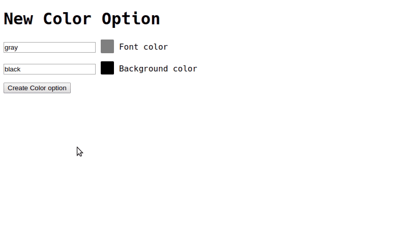
These will be updated by the Color Picker. The columns can currently be updated using a regular rails form.
app/views/color_options/_form.html.haml
= form_with(model: local_assigns[:model], local: true) do |f|
  .field
    = f.text_field :font_color
    = f.label :font_color
  .field
    = f.text_field :background_color
    = f.label :background_color
  .field
    = f.submit
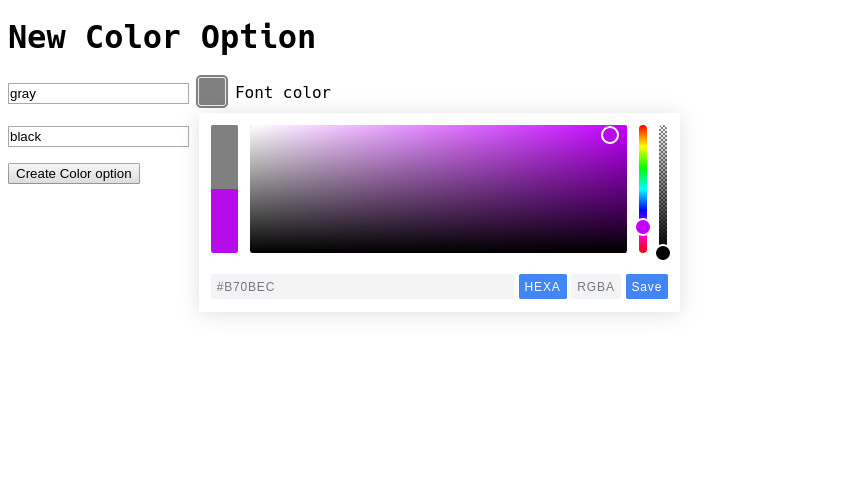
Pretty standard stuff, now lets get the Color Picker library installed.
Install with Yarn & Webpacker
Add the Pickr library using yarn
Command Line
yarn add @simonwep/pickr
Afterwords, create a css file to load the module’s styles.
app/javascript/stylesheets/color_picker.css
/*Change 'classic' to which ever theme you are using from Pickr*/
@import '@simonwep/pickr/dist/themes/classic.min.css';

/*Custom form field style*/
form .field .pickr {
  display: inline-block;
}
NOTE: If you do not use a css style path such as
app/javascripts/stylesheets/in your build, you can load the the Pickr library styles in thepacksfile.
app/javascripts/packs/application.js
import '@simonwep/pickr/dist/themes/classic.min.css';
Stimulus Integration
app/javascript/controllers/color_picker_controller.js
import { Controller } from "stimulus";
import Pickr from "@simonwep/pickr";
import "../stylesheets/color_picker.css";

export default class extends Controller {
  static targets = ["picker", "input"]

  initialize() {
    this.initPicker();
  }

  initPicker() {
    this.picker = Pickr.create({
      el: this.pickerTarget,
      theme: 'classic',
      default: this.inputTarget.value,

      components: {
        preview: true,
        opacity: true,
        hue: true,

        interaction: {
          hex: true,
          rgba: true,
          hsla: false,
          hsva: false,
          cmyk: false,
          input: true,
          clear: false,
          save: true,
        },
      },
    });

    this.picker.on('save', (color, _instance) => {
      this.inputTarget.value = color.toHEXA().toString();

      this.picker.hide();
    });
  }
}
We load the Pickr class from the node module at the top of the stimulus controller file along with the stylesheet.
NOTE: Do NOT load the stylesheet if already imported in app/javascript/packs/application.js
import Pickr from "@simonwep/pickr";
import "../stylesheets/color_picker.css";
We have two stimulus targets.
static targets = ["picker", "input"]
-
this.pickerTargetThis is the HTML element we will be using to initialize the Picker class with. It will turn the element into a Picker button.
-
this.inputTargetThis Is the HTML form input we will fill after a color has been selected/picked.
We use the initialize() stimulus lifecycle function:
initialize() {
  this.initPicker();
}
To call this.initPicker() which contains all of the logic to intialize the Pickr component.
We set an instance of the Pickr class to this.picker in order to use in the callback.
initPicker() {
  this.picker = Pickr.create(...)

  //ect...
}
The create settings were provided by the Picker README with the exception of setting el and default.
el: this.pickerTarget,
default: this.inputTarget.value,
This uses the controller’s this.pickerTarget to set the picker element, and the value of this.inputTarget to initialize the Picker with.
We then use the on save Pickr callback in order to:
- Set the input field’s value
- Hide the widget
After a user has clicked “Save” on the Color Picker.
this.picker.on("save", (color, _instance) => {
  this.inputTarget.value = color.toHEXA().toString();

  this.picker.hide();
});
Final Touches
Now all we have to do is update our form partial to utilize the color-picker controller.
app/views/color_options/_form.html.haml
= form_with(model: local_assigns[:model], local: true) do |f|

  .field{ data: { controller: "color-picker" } }
    = f.text_field :font_color, data: { target: "color-picker.input" }
    %div{ data: { target: "color-picker.picker" } }
    = f.label :font_color

  .field{ data: { controller: "color-picker" } }
    = f.text_field :background_color, data: { target: "color-picker.input" }
    %div{ data: { target: "color-picker.picker" } }
    = f.label :background_color

  .field
    = f.submit